

Cancel. Okay…?
Buttons. Buttons everywhere. Buttons for accepting cookies, buttons for declining cookies, buttons to warn and buttons to accept. Buttons are everywhere. Inconsequential choices add up to produce a functional website, but some still look and feel nicer than others. So altogether, they can’t be inconsequential! How do you assemble buttons the right way?
Left, or Right?
As an English-speaker, I read left-to-right. Latin-based languages go left-to-right. Book pages in English and European languages go left-to-right. The most logical way to design a page in those Latin languages is to put the ‘go back’ button on the left, and the ‘go forward’ button on the right. This applies to the buttons that approve an action, as well – in an online shop, the check-out button is usually on the right, as well as the finish-and-pay button on the next screen.
Even countries that don’t read left-to-right use this format! Japanese, Chinese, and Arabic online shops available to English-speakers also commonly use the right = forwards format. It’s become a principle of website design, rather than a choice based on language.
Decisions, Decisions
What colors should your button be when you’re not using red and green? Some cultures reverse the meanings of red and green – Red is lucky in many cultures, and while green is ‘good’ and ‘go’ to a lot of the Americas and West Europe, it’s ‘stop’ and ‘wait’ in others. Blue is a color of approval in some of the nations where green isn’t. Blue and red aren’t commonly yes/no coded in America, though, so the red button would be doing a lot of the heavy lifting, visually. Customers don’t like to read too much – that could be a problem!
But we’re not dealing with just plain old colored squares, here; there’s other information in the box. Some countries use a circle, instead of the classic check mark, to indicate approval.
Multi-national company Nintendo simply uses a green circle and a red X, which gets the message across pretty clearly. Other options include just using the green check/red X anyway, and assuming any possible users will be familiar with the concept. At the very least, they’ll know the red X part, right? Generally?
How do you decide what color the affirmative is if you don’t want to use green or red?
Many modern looks build this in: the affirmative is simply filled in with whatever secondary color the rest of the site is using, and the other button is the same color as the background. It highlights the ‘good’ option for the end user, without introducing new colors into the mix. It can be a little bland, and it fails to catch the eye if the entire website is just one or two colors, but it is an option.
Alternatively, introducing an accent color only used in the buttons looks disjointed, so be sure to use accent colors in more than one place if you’re going this route. The red/green option doesn’t count as extra colors in most customers’ minds, so it’s exempt from the accent color issue. Don’t make cancel buttons green, and you’re golden!
X or Decline, for Cookies?
You might notice that the pop-ups with a website’s cookie warning on it frequently come with no cancel button, only an ‘X’ in the top right and an ‘Accept’ center-stage.
Would a cancel button really help? Remember, these websites really want you to have their cookies, so they’ll do things that convince you to click ‘accept’. Including purposefully confusing the end-user as to what their options are.
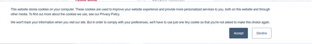
Lately, I’ve been to websites that don’t offer up the ‘x’ for the notification at all! It’s either ‘accept cookies’ or nothing. Not clicking the box is taken as a pause, instead of a decline – the website’s still perfectly usable with the banner there, it’s just really annoying to have to zoom out on the website to see everything.
How badly do you want users to hit your button? Are you willing to annoy them for it? If so, go ahead and erase all traces of a cancel button. They can accept the cookies… or live with the bulky banner. Alternatively, adding a small ‘x’ in the top right corner is less annoying, and allows the user to avoid your cookies. While it might not get the desired number of cookies, users may be inclined to leave the site without it!
Cancel? Go Back? No? X?
Buttons should also be specific. If the buttons appear for a negative action (such as removing an item from an online shopping cart), the button to complete the action should be labelled with it, so that the user isn’t confused by the other button, which is usually ‘cancel’ or ‘go back’. Asking an end user ‘Are you sure you want to cancel your order?’ with ‘yes, cancel’ and ‘no, go back’ is much clearer than ‘yes’ and ‘no’, for example. Correctly phrasing the question is also critical – there should be no confusion over what you’re asking the customer to do. “Task Failed” with options of “OK” and “Cancel” aren’t nearly clear enough – what does cancel do, here?
Color also comes in! Red is a great color for completing a ‘negative’ action. Customers don’t really like to read, and if they glaze over a ‘delete permanently’ button because it was in blue, well, they’re probably going to be upset. One article from UX Movement says 30% of data loss was human error. People either clicked the wrong button, or didn’t read thoroughly enough, and ended up causing themselves a lot of trouble when the designer could have made the buttons a little clearer. Sure, it’ll be slightly uglier, but if the item is truly critical, users won’t mind. Make your negatives brightly colored – red, orange, whatever, as long as it draws a lot of attention!
Just Words – Or a Box?
This one’s easy: do you prefer form, or function? Having just the clickable text sure looks snazzy, but it can easily annoy the end consumer who doesn’t know how much leeway they have. Even a slightly gray line around the area that’s clickable makes the consumer’s life much easier!
An expert in UI design, Nick Babich, suggests making buttons ‘look like’ buttons, because it makes it much easier to tell what’s clickable vs. what’s not. However, many sites just list out text and assume the user knows to click it via context. The words “book” or “locations” mean nothing if they aren’t clickable, but it assumes the user has some experience with other websites. It’s a safe bet now, but 90’s era websites didn’t have that guarantee, and so everything on cutting-edge websites was a button, not regular text.
Alternatively, it’s possible to use both – highlight one button with a box, and leave the other un-boxed. Context clues again allow the end user to assume that the other option is also clickable. This has two benefits: it highlights the option the website wants the users to pick, and it saves space, so the buttons don’t have to be either tiny or weirdly narrow. Visually, a little bit of button padding surrounding the text looks nice – people like it best when that padding is the same all around.
See this example from the City of Las Vegas website:
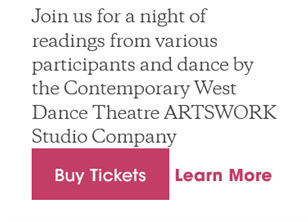
The “Buy Tickets” button has an even surrounding of pink all around, and the “Learn More” button sits much closer to it than it would be able to if it were also boxed. Both buttons can be bigger as a result!
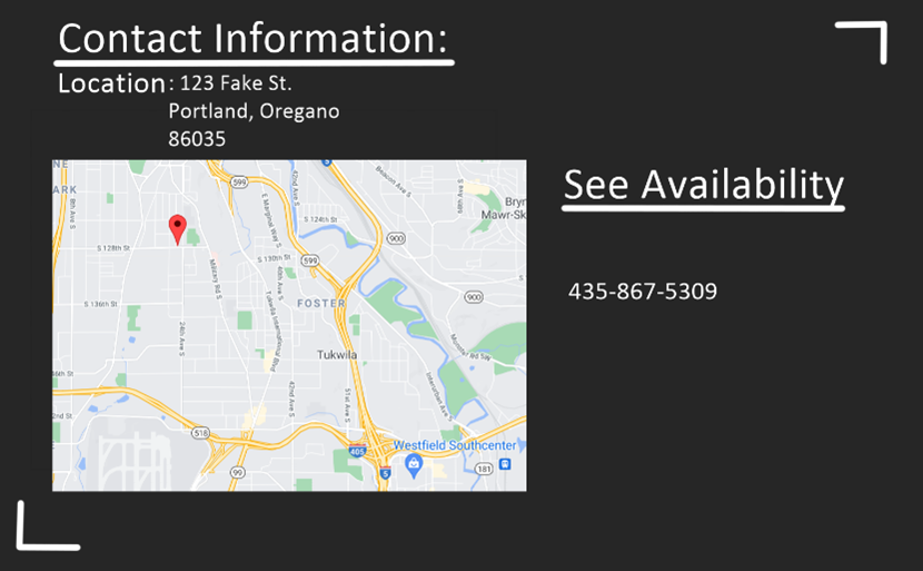
It’s important to be clear when the clickable object is a standalone. If I saw ‘See Availability’ and then a phone number in plain text when scheduling for a haircut, I might assume I would need to call. However, the website could be keeping their scheduling in a hidden menu only visible with the button, but I didn’t design the site, and I don’t know that. What seems obvious to the designer is sometimes hidden to the user. Standalone text should be button-like!
Sources:
(Credit to @designertom on TikTok for bringing up valuable points about buttons)