

I’ve seen all of these. Witnessed them with my own eyes. How can a fair and just universe allow such crimes?
Anyway… here’s how to make a bad UI for your fillable forms.
1) Be sure to use a dropdown wherever you can.
It is so much easier to just include a type-in text box than it is to try and imagine every. Possible. Response to your question. Exceptions are rare: countries, states, shipping speeds, and other static items are suitable for dropdown menus because their numbers are limited. Anywhere or anything else? A dropdown can be a nuisance, especially because you might still miss options if you’re trying to keep your menu short. There’s nothing more irritating than a question asking me to be specific when they don’t have my option!
Dropdowns should also be avoided if the user could want to select multiple items: dropdowns are for single choices. They aren’t meant to act like checklists. Picture trying to order a burger for online pickup, but the ‘extras’ selection menu is a dropdown. I can have extra onion or extra pickles, but not both without calling in the order. Why?!?
1.5) Mix unrelated items into the same dropdown menu.
Ryanair forces (or at least used to force) their users into adding insurance by putting the opt-out option in the same menu as the location choices. Users who didn’t want the insurance may have already given up on finding the opt-out option by the time they’re picking their insurance, only to discover it near the bottom of the menu. That doesn’t mean they now want the insurance. It just means they’re frustrated by Ryanair. A yes/no question shouldn’t have the conditionals for ‘yes’ in the same list as a hard ‘no’.
Ryanair’s reputation is garbage because of decisions like these. Is the short-term money worth alienating customers?
2) Make the dropdown incredibly long, and don’t organize it alphabetically.
Once again, including a typed response or blank box ‘other’ option allows a business a lot more flexibility than listing out every. Possible. Response, but if you have to, arrange it in a way that makes sense. Some UI websites even recommend breaking down your menus into submenus, so Greek users looking for expedited service on your site can select the “Expedited” option from service levels, and then “Greece” from there. Each menu is shorter and easier to navigate when broken down by relevancy. You don’t need to list Greece twice in the same drop-down for first-class and then expedited shipping.
If you want your users to suffer, don’t arrange your inputs in any logical manner! Numbers can be in any order you want! European countries should be mixed in with the Asian and African ones, and there better not be any alphabetizing going on! Don’t forget to put Sealand at the top!
3) No autofill.
We die like men, scrolling through that endlessly long dropdown with two or three options for every state or country, to get to where we want to be. Most good dropdowns allow the user to type the first couple of letters of what they want, so they can skip opening the menu entirely. On eBay, I
hit the keys “N V” and I get to NV without needing to even open the menu. However, that’s a good idea. And we’re not doing good ideas today. Bad dropdowns don’t accept typed input. If you’re really feeling evil, make sure the button presses interact with the page in a strange way, like highlighting questions or activating the ‘next page’ button. For some reason.
4) Don’t allow users to leave it on “select an option” or blank.
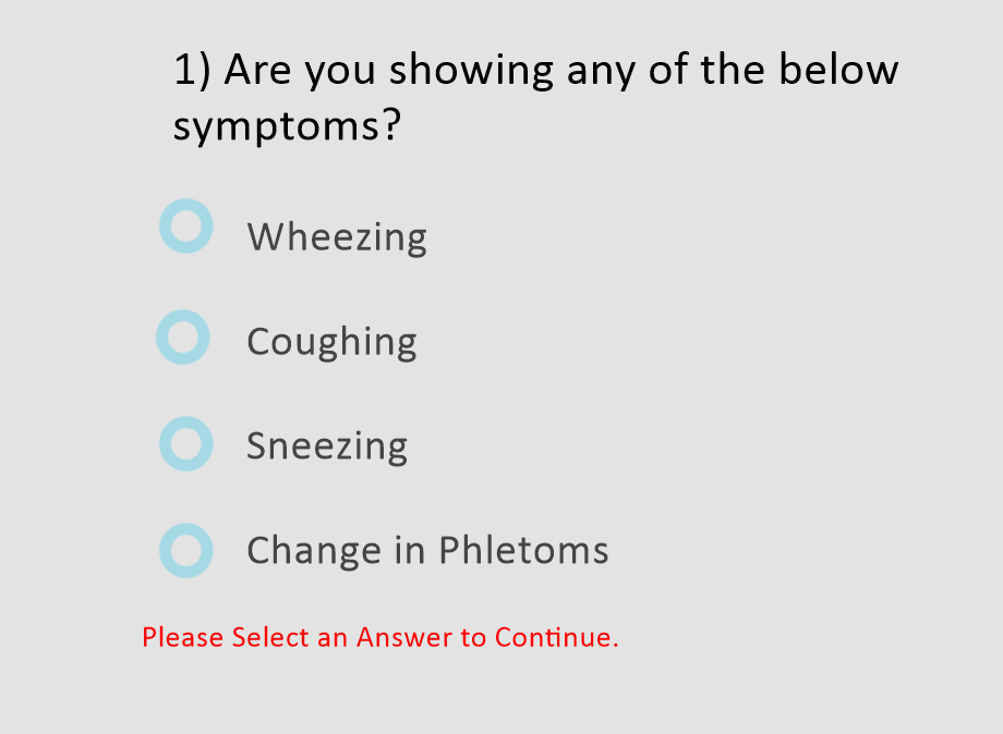
Listen, websites shouldn’t punish users for accidentally clicking on a drop-down only to realize it doesn’t apply to them. If the ‘leave blank’ option disappears after clicking, then it’s poorly designed – for those ‘leave blank’ slots, users should be able to un-click the box or leave it. For example: Users may be coerced into picking ‘sneezing’ if they really can’t leave this question blank.
This also applies to question trees. A user should always be able to go back and select ‘no’ for a question that comes with follow-up questions, without having to still answer the follow-ups. Accidentally selecting ‘yes’ to special instructions and then having to type N/A in the pizza delivery place’s special instructions box makes users feel like they’re being annoying!
Similarly, optional multi-choice questions should either be possible to uncheck or have a “none of the above” option. Don’t make users refresh the page to get their correct answer!
5) For necessary items, let users skim past.
On the other hand, some dropdowns shouldn’t default to an option that allows the computer to continue forward. If you’ve ever checked out from a small website before, you’ll know that sometimes they put the USA and Canada at the top in shipping – their most used options get to go first. However, the USA shouldn’t be in that blank select-a-place box automatically. Locations for shipping are one of the few things absolutely necessary to complete an order, and if the customer misses that, they’re going to have a bad time. After all, there’s a Paris in Texas and an Athens in Georgia! Don’t default to USA just because it’s the most used option, or skimming customers are going to be very angry when their package doesn’t arrive.
6) Don’t include Dialogue Boxes When Doing Negative Actions
Dialogue boxes prevent mis-clicks from destroying your user’s life, patience, and data. Even a single ‘are you sure’ prevents tons of data loss. Remember, around 30% of the data lost last year was due to human error, and that’s with verification – the number would be much higher without these checks in place.
If you want to do a bad job, go ahead and skip these altogether! No verification questions! No dialogue boxes! Clicking the little trashcan icon once makes the item disappear forever! Now your user is mad!
Alternatively, if you want to do a terrible job subtly, it’s always a bad idea to be vague. Be as vague as possible when designing your verification question. “Are you sure you want to X?” is too many words. Make that question as confounding as possible.
“Complete Action?” “Don’t Delete X?” “Delete?” “Keep X?” and so on. Only having the options of “Cancel” and “No” are also good for maximum confusion.
6.5) Include too many Dialogue Boxes
You could also use a dialogue box for every action to make a bad site.
Search for X.
Nice, I have results. Add to Cart? Are you sure you want to do that? Oh, you are? Okay. Oh, you want to add this to the cart too? Are you sure? Hmm, okay. How about leaving this page to go to the next one, are you sure you want to do that? No? See, I saved you a click! Oh, I’m sorry, you must have hit the wrong button, you really did want to go to the next page, heh. Do you really want to narrow down your search results? Are you sure? Are you sure, you’re sure? Are you-
7) Make the end user do too many things to access certain information.
If you want to waste everyone’s time, make the end user fill out the entire form to get to critical information, such as when appointments are held or what requirements must be met to enter the building. The end user doesn’t even know if they’re even interested in the service yet!
If the business needs to screen appointments, it can do that when the customer is actually going to make the appointment. If the business can only accept certain file types for printing, it needs to make that clear before the customer goes through all the work of selecting the style of banner they want.
If you want your end users to suffer, be completely opaque about whether or not your services will suit them. Heck, you could even go so far as to hide your business hours! “Hah, you’re looking for music lessons, and you want to know what kind of music instructors we have? Too bad, fill out this skill level form before we tell you that we don’t teach the flute here. Or adults, we’re kids-under-14 only.” Do that. If you want your website to cause frustration, do that.
Sources:
https://uxdesign.cc/the-ux-of-security-questions-4edbbb687e83
https://careerfoundry.com/en/blog/ux-design/10-classic-ux-design-fails/
https://uxplanet.org/5-essential-ux-rules-for-dialog-design-4de258c22116